
Streetwear Typography: Lessons from Skate Culture
Skateboarding has shaped streetwear and design through its DIY ethos, bold visuals, and rebellious spirit. Typography in skate culture isn't just about style - it’s about communicating identity, values, and attitude. From hand-drawn designs to iconic logos like Supreme's box logo or Thrasher's flame lettering, skate-inspired typography has become a global phenomenon. Key traits include bold sans-serif fonts, graffiti-like scripts, and oversized text that grabs attention.
Modern brands like Carbonated Thoughts are blending these styles with messaging on social and political issues, keeping the spirit of skate typography alive while connecting with contemporary audiences. Whether it’s a hoodie, skateboard deck, or sticker, the typography reflects a commitment to individuality and self-expression. These designs prove that typography can be both a visual statement and a tool for meaningful communication.
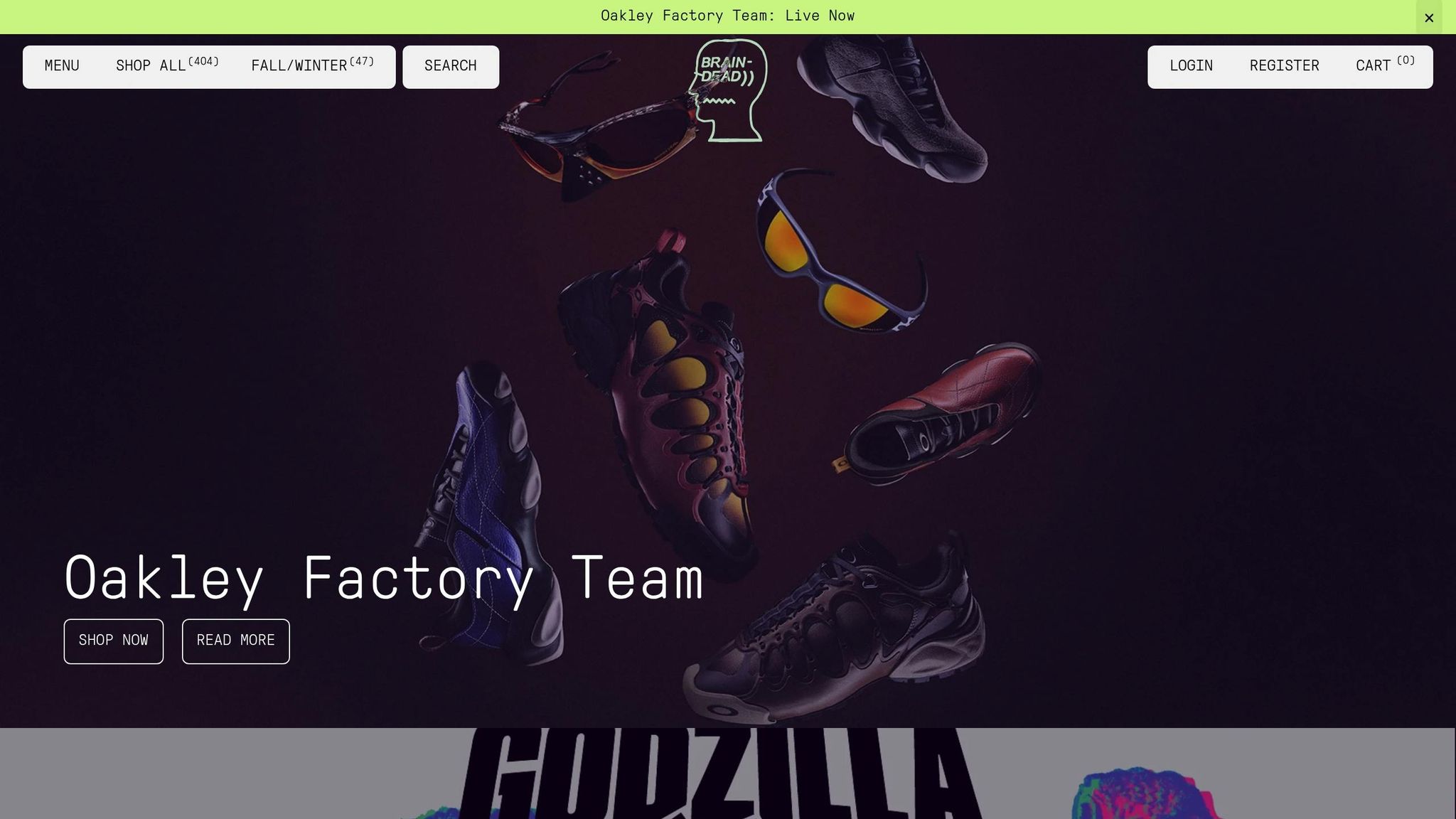
How to design Skatewear t-shirts like Braindead and Obey
Core Elements of Skate-Inspired Typography
Skate typography stands out for three defining traits that perfectly capture the edgy, rebellious vibe of skate culture. These traits combine to create designs that are not only visually striking but also practical for streetwear.
Bold and Legible Designs
At its core, skate typography is bold and unapologetic. Heavy sans-serif fonts dominate, designed to cut through the visual noise of urban environments.
Take Supreme's iconic box logo, for example. Using Futura Heavy Oblique, this design achieves maximum impact with minimal elements. It's a masterclass in simplicity that continues to resonate. In 2024, Supreme's limited-edition box logo tees sold out within minutes, with resale prices soaring to 10 times their original value. This enduring success underscores the power of bold, minimalist typography.
But skate typography isn't just about clean lines. Graffiti-inspired scripts add a raw, expressive edge. A classic example is Thrasher Magazine's flame logo, introduced in the 1980s. Its hand-drawn, graffiti-style lettering encapsulates the urban storytelling found in street art, where designs often communicate identity and crew affiliations.
Clarity is non-negotiable. Skate typography needs to work across a range of formats - whether it's a small sticker or the back of a hoodie. The designs are both decorative and declarative, ensuring the message lands with the same impact as a perfectly executed trick.
This boldness naturally leads into the DIY spirit that defines skate culture.
DIY Aesthetic and Customization
Skateboarding thrives on a do-it-yourself ethos, and its typography reflects that. It’s not about polished, corporate designs - it’s about raw, handmade expression that rebels against mainstream aesthetics.
Look at Stüssy’s signature script logo. Inspired by Shawn Stüssy’s hand-drawn signature, it embodies the personalized, imperfect charm that has influenced countless skate and streetwear brands. The slightly rough, human touch of hand-drawn lettering gives it a unique character that feels personal.
This DIY style often includes fragmented or distressed typography, where letters appear worn, edges are rough, or spacing is irregular. These deliberate imperfections mirror the wear and tear of a well-used skateboard, celebrating individuality and imperfection.
What’s more, DIY typography is inherently accessible. Anyone with a marker can create their own designs, tweak existing ones, or add a personal touch. This democratic approach turns typography into a tool for self-expression, not just brand promotion.
From this handmade aesthetic, we move to the dramatic impact of oversized text and layered designs.
Layering and Oversized Text
In skate culture, visual impact is everything, and oversized, layered text delivers just that. This style reflects the oversized silhouettes often seen in skate fashion, where bigger is always bolder.
Layering techniques add dimension and hierarchy by stacking text, experimenting with transparency, or mixing font weights and styles. A typical design might feature a large, light-colored background word with smaller, bold text layered on top in a contrasting color.
On tees and hoodies, oversized text transforms clothing into a canvas for personal expression. The large scale ensures the message is impossible to ignore, whether someone’s skating through the streets or just hanging out at the park.
To amplify this effect, designers often use bright, dynamic color palettes - think neon greens, electric blues, and hot pinks. These colors echo the energy of hip-hop and street dance cultures that intersect with skateboarding. The result is typography that grabs attention and refuses to blend into the background.
This approach isn’t just about aesthetics - it’s practical, too. Skate culture values designs that photograph well for social media, look good on various garment types, and maintain their punch whether viewed up close or from afar. The outcome? Typography that’s as functional as it is eye-catching.
How Culture Shapes Skate Typography
Skate typography has grown out of decades of blending influences, from local skateboarding scenes to underground art movements. These diverse roots have shaped the bold and distinctive visual style that dominates streetwear today.
Regional Roots and Subcultural Crossovers
The geography of skateboarding plays a big role in shaping its typography. California's surf-inspired culture and the East Coast's gritty urban skating scene have each left their mark, creating distinct typographic styles that continue to influence design.
On the West Coast, skateboarding's origins are tied to 1950s surf culture. This laid-back, beachy vibe carried over into typography, with hand-drawn, wavy designs reflecting the carefree spirit of the scene. Think of Stüssy's flowing script logo or Vans' relaxed lettering - both evoke the easygoing, hand-crafted feel of surf culture.
In contrast, East Coast skating emerged in tougher, urban landscapes. Brands like Supreme and Zoo York adopted bold, hard-edged typography that mirrors the raw energy of city streets. Punk and hip-hop subcultures also left their mark. Punk's DIY aesthetic can be seen in the rough, cut-and-paste fonts of brands like Thrasher and Anti-Hero, while hip-hop brought oversized, colorful logos that turn clothing into bold statements of personal style.
| Influence | Key Typographic Traits | Example Brands |
|---|---|---|
| California Surf | Hand-drawn, relaxed, wavy lettering | Stüssy, Vans |
| East Coast Urban | Bold, gritty, graffiti-inspired | Supreme, Zoo York |
| Punk | DIY, cut-and-paste, distressed fonts | Thrasher, Anti-Hero |
| Hip-Hop | Oversized, colorful, statement logos | Palace, Carhartt |
These regional styles set the stage for skate typography's evolution, especially as it intersected with street art.
Graffiti and Street Art Inspirations
Graffiti didn't just influence skate typography - it reshaped it completely. Street art brought an experimental edge, breaking away from traditional design rules. Graffiti artists, known for their bold and oversized lettering, created a visual language meant to grab attention from a distance. Skate brands adopted this approach, embracing layered text effects and hand-drawn type that feels like it was tagged on a wall. This raw, accessible style - where anyone with a marker can create their own designs - fits perfectly with skateboarding's rebellious, DIY ethos.
But skate typography doesn't stop at aesthetics; it also carries deeper messages.
Social and Political Messaging
Skate typography has always been more than just a visual style - it’s a way to amplify the voices of the community. It often serves as a platform for social and political messaging, reflecting the values of skaters while challenging societal norms. This tradition continues today with platforms like Carbonated Thoughts, where typography takes on issues like social justice and environmental activism. Designs such as "We Must Do Better" and "The Earth Don't Need Your Sorry Ass" stickers, or "Save the Bees" swim trunks, use bold lettering to spark conversation.
The rebellious spirit of skateboarding naturally lends itself to protest. Skate typography transforms everyday items - like clothing and skateboards - into tools for social commentary. This reflects skateboarding's roots as a counterculture that questions authority and celebrates individuality. In fact, the global streetwear market, which owes much of its influence to skate culture, was valued at over $185 billion in 2019. Skate typography’s power lies in its ability to make bold statements while fostering a sense of community. When you wear a piece that speaks these truths, you’re not just making a fashion choice - you’re joining a decades-long cultural conversation.
sbb-itb-e116ef9
Examples of Skate Typography in Streetwear
Iconic brands have turned simple lettering into symbols that define streetwear culture. Let’s dive into how some of the biggest names in skatewear have used typography to shape their identities.
Typography in Skatewear Brands
Thrasher Magazine set the benchmark for skate typography back in 1981. Its bold, flame-inspired logo screams rebellion and embodies the DIY spirit of skate culture. Sporting a Thrasher shirt isn’t just about wearing a brand - it’s a statement of belonging to the skateboarding community, capturing its raw, unfiltered energy.
Supreme took a completely different route with its minimalist box logo, introduced in 1994 by founder James Jebbia. The design, heavily influenced by Barbara Kruger’s conceptual art, features clean white Futura font on a red rectangle. This simplicity has turned it into a global symbol of exclusivity and status.
Palace Skateboards, a London-based brand, brings a playful twist to skate typography. Known for its iconic "Tri-Ferg" logo, Palace frequently experiments with warped text and hand-drawn fonts, reflecting skate culture's irreverent and creative side.
| Brand | Typography Style | Key Elements | Cultural Impact |
|---|---|---|---|
| Thrasher | Bold, fiery lettering | Aggressive edges, flame-inspired design | Represents rebellion and authenticity |
| Supreme | Minimalist box logo | White Futura on red rectangle | Global icon of exclusivity |
| Palace | Playful, experimental | Warped text, hand-drawn fonts | Embodies creative irreverence |
These brands demonstrate how typography can become a core part of a brand's identity, influencing both style and culture.
Case Study: The Supreme Box Logo
Supreme’s box logo is a study in minimalist design done right. Its clean white Futura Bold Oblique font on a red background delivers instant visual impact, making it work across everything from basic tees to high-end collaborations. This restrained approach mirrors skateboarding’s core values: staying authentic and focusing on substance over flash. The logo’s consistency has made it one of the most recognizable designs in the world, offering a lesson in how simplicity can create lasting cultural resonance.
Experimentation in Limited Editions
While core logos stay consistent, limited edition releases allow brands to push creative boundaries. Supreme has played with graffiti-inspired lettering and distorted fonts for special events and collaborations, while Palace regularly incorporates warped text into its capsule collections. Collaborations like Supreme x Nike and Palace x Adidas have introduced custom typefaces that strike a balance between brand identity and innovation.
A newer name like Carbonated Thoughts is also making waves by blending bold typography with social messages. Designs like "We Must Do Better" and "Move Past Fear" borrow from skatewear’s bold aesthetic while addressing modern issues. These examples show how brands can respect skate typography’s roots while staying relevant in today’s world.
Lessons for Contemporary Designers and Brands
Skate culture's approach to typography offers some fascinating lessons. The journey from hand-drawn deck art to globally recognized brands provides key takeaways that designers today can apply across various industries and mediums.
Prioritizing Individuality in Design
One of the standout lessons from skate typography is the importance of staying true to your roots rather than chasing fleeting trends. Early skaters expressed themselves through hand-drawn typography and graffiti tags, creating designs that were deeply connected to their community and culture.
For modern designers, this means crafting a visual identity that reflects their core values while resonating with their audience. With today’s advanced tools and platforms, it’s possible to maintain the bold and rebellious spirit of skate typography while achieving a polished and consistent look. Balancing authenticity with scalability is both a challenge and an opportunity for brands looking to carry forward the legacy of skate culture. This focus on individuality naturally leads to typography that makes a bold statement, becoming a key part of a brand’s identity.
Typography as a Statement
Skate culture has shown us that typography is more than just decoration - it’s a form of expression. The rebellious, "DIY, no rules" attitude of graffiti aligns perfectly with skateboarding's ethos, making it an ideal medium for brands aiming to make bold, unfiltered statements. The dynamic use of color, movement, and bold shapes in graffiti demonstrates how mixed media - from spray paint to digital tools - can create typography that doesn’t just look good but also speaks volumes.
Designers are encouraged to go beyond simple tags and explore more complex compositions that carry deeper meaning. Skate-inspired typography often conveys social or political messages, creating a stronger emotional connection with audiences. By leveraging this power, brands can use typography not just as a design element but as a tool for meaningful communication.
Modern Approaches in Today's Platforms
Many contemporary brands are successfully blending skate typography principles with modern social awareness. Take Carbonated Thoughts, for example. This brand combines bold, statement-making visuals with causes that matter. Their "Pope Of Love" project uses typography to challenge societal norms while promoting social change, featuring products with slogans like We Must Do Better and Move Past Fear.
Platforms like Carbonated Thoughts show how typography can be a force for democratizing art, activism, and creativity. For modern designers, the takeaway is clear: typography is most impactful when it serves a purpose beyond aesthetics. Whether addressing environmental issues, advocating for social justice, or fostering community connections, typography that carries a message retains the rebellious energy that made skate culture’s visual style so influential in the first place.
Conclusion: The Enduring Legacy of Skate-Inspired Typography
Skate culture has left a lasting mark on streetwear typography, shaping it into more than just bold fonts and edgy slogans. From the hand-drawn deck art of the 1970s to the globally recognized designs of today, skateboarding's DIY ethos and dedication to genuine self-expression have redefined how streetwear communicates visually. This influence continues to push design and cultural boundaries forward.
The staying power of skate-inspired typography lies in its unwavering commitment to individuality. Take Supreme's iconic box logo, for instance - its simplicity and consistency make it instantly recognizable while still carrying a rebellious undertone. This kind of typography transforms into a statement, resonating with audiences by delivering meaning that goes beyond mere aesthetics.
Collaborations between brands have also played a key role in keeping skate-inspired typography fresh. These partnerships blend diverse influences, reflecting skateboarding's tradition of community-driven creativity. Today, this collaborative spirit extends even further, as modern platforms combine art, activism, and design to create unified brand experiences.
A great example of this evolution is Carbonated Thoughts, which pairs bold typography with socially conscious messaging. By addressing contemporary issues like social justice and environmental challenges, skate culture’s rebellious voice continues to stay relevant while staying true to its roots. This approach ensures that skate-inspired typography remains a tool for sparking conversations and driving meaningful change.
What makes skate typography so impactful is its accessibility. It proves that you don’t need formal training or costly tools to create powerful design - just a strong message and the courage to express it. Designers and brands today continue to tap into this ethos, crafting typography that speaks to audiences who value authenticity over surface-level appeal.
Staying rooted in skateboarding's DIY spirit, modern typography disrupts conventions and amplifies voices. Streetwear thrives by holding onto its origins, using typography not just to decorate but to communicate. This legacy isn’t just about how text looks on a t-shirt - it’s about how design can carry culture, challenge the status quo, and build real connections between brands and their communities.
FAQs
How does skate culture's DIY spirit shape streetwear typography?
Skate culture's DIY spirit plays a huge role in shaping streetwear typography, bringing in bold, raw, and expressive design elements. Think hand-drawn lettering, graffiti-inspired fonts, and layouts that break all the rules - these styles channel the rebellious and creative vibe of skateboarding communities. Instead of chasing perfection, they celebrate authenticity, giving each design a one-of-a-kind, personal feel.
This impact goes beyond just aesthetics. Typography influenced by skate culture often carries messages about individuality, social causes, or even environmental issues. By embracing flaws and constantly pushing creative limits, skateboarding continues to leave its mark on the visual identity of modern streetwear.
How do West Coast surf culture and East Coast urban environments influence skate typography styles?
Skate typography styles are a direct reflection of the cultural energy from which they emerge. Take West Coast designs, for example - they channel the essence of surf culture with fluid, wave-like lettering and bold, carefree vibes that mirror California’s relaxed lifestyle. Bright colors and organic shapes dominate, evoking the sun-soaked, coastal atmosphere.
In contrast, East Coast typography embodies the raw, urban intensity of cities like New York. These designs feature sharp, angular fonts, graffiti-inspired details, and darker tones, perfectly capturing the gritty, fast-moving spirit of urban skate culture. Together, these styles highlight the rich variety of artistic expression that thrives within skateboarding communities across the country.
How do skatewear brands use typography to reflect social and political themes?
Skatewear brands have a knack for using bold, striking typography to deliver powerful social and political messages. This design approach mirrors the rebellious essence of skate culture, often featuring slogans, graffiti-inspired fonts, and unconventional layouts that push boundaries and ignite conversations.
But typography in skatewear goes beyond just looking cool - it's a way to tell stories and advocate for change. By pairing distinctive typefaces with meaningful statements, these brands connect with their audience on a deeper level, tackling topics like equality, environmental issues, and strengthening community bonds.