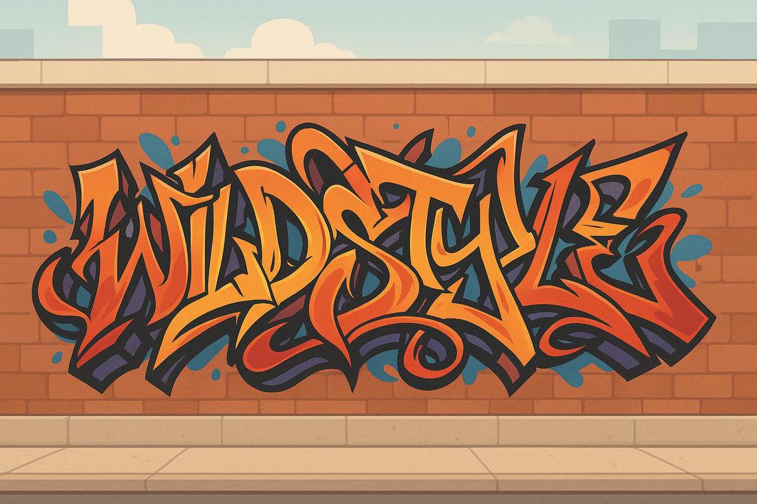
How to Draw Wildstyle Graffiti Letters
Share
Wildstyle graffiti is a bold, abstract form of lettering that transforms basic letters into dynamic, interlocking designs. Originating in 1970s New York City, it’s known for its arrows, curves, and overlapping shapes that create a puzzle-like effect. This style is challenging to master but offers a great way to push your artistic skills.
Here’s what you need to get started:
- Tools: Use pencils (HB or 2B), fine liners, erasers, and markers (alcohol-based like Ohuhu or acrylic-based for highlights). For digital work, software like Procreate or Photoshop and a pressure-sensitive tablet are excellent choices.
- Surfaces: Practice on smooth paper or blackbooks. For advanced work, try textured surfaces like wood or canvas.
-
Steps:
- Start with simple block letters as your base.
- Add arrows, curves, and overlapping shapes for complexity.
- Refine the design by balancing readability and flow.
- Use shadows, highlights, and bold colors to bring depth and energy to your work.
Wildstyle is all about practice, experimentation, and developing your personal touch while balancing flow and negative space. Whether you’re sketching on paper or creating digital designs, this guide will help you lay the groundwork for stunning Wildstyle graffiti.
How To Draw Graffiti Letters Wild Style - Advanced Tutorial Alphabet
Tools and Materials You Need
To create sharp lines, smooth gradients, and professional Wildstyle designs, having the right tools is key.
Traditional Drawing Tools
Start with pencils, the backbone of any Wildstyle sketch. For initial structures, HB or 2B pencils strike a great balance between darkness and control. If you're curious about pencil hardness, the scale ranges from 8B (soft and dark) to 6H (hard and light), giving you plenty of room to experiment as your skills grow. Brands like Staedtler and Faber-Castell are reliable for their durability and consistent graphite quality.
You'll also need a good eraser for refining your designs. A Faber-Castell eraser works well, removing marks cleanly without harming the paper. Since Wildstyle often involves overlapping shapes, expect to make adjustments as you go.
For straight lines and precise 3D blocks, rulers are a must. Try a rolling ruler for larger compositions. Meanwhile, fine liners are perfect for outlining and adding details, giving your letters sharp, clean edges.
When it's time to add color, markers are your go-to. Alcohol- or water-based markers create smooth gradients, while acrylic-based markers work great for highlights and outlines. If you're on a budget, Ohuhu markers offer excellent value compared to pricier brands like Copic Ciao. For beginners, Stabilo pen 60 markers are an even more affordable option.
For fine details like cracks or light reflections, fineliner pens with 0.4mm or 0.5mm tips are indispensable.
Prefer a digital approach? Let's dive into the tools you’ll need.
Digital Drawing Tools
Digital tools provide precision and flexibility for Wildstyle designs. Look for software that supports customizable brushes, vector capabilities, and perspective rulers.
Adobe Photoshop is a top choice for digital art and image editing. It’s versatile but requires a subscription and has a steeper learning curve.
If you’re an iPad user, Procreate is a fantastic option. It’s user-friendly and perfect for creating Wildstyle designs on the go, though it’s limited to raster graphics and iPads.
For beginners, Krita is a free, open-source program with solid brush options and essential features. It’s a great starting point without the complexity of advanced software.
Clip Studio Paint shines when it comes to detailed work, thanks to its natural pen pressure detection. It offers flexible payment plans, though its interface can feel tricky at first.
If you’re after a Photoshop alternative, Affinity Photo is worth considering. It has a one-time purchase cost and covers most Wildstyle needs, though it lacks some advanced features.
Pressure sensitivity is critical for digital Wildstyle work, letting you vary line thickness and create realistic shading. Make sure your software supports your device and common file formats for smooth collaboration.
Now, let’s talk about the surfaces you’ll be working on.
Picking the Right Surface
Your choice of surface can make or break your Wildstyle artwork. Factors like texture, size, and material all play a role in how your designs come to life.
For clean, detailed lines, go with smooth surfaces like canvas or quality paper. If you want to add natural texture, try rough surfaces like wood or textured paper.
When practicing, multi-purpose printer paper is a practical choice. For more detailed work, upgrade to blackbooks, Bristol paper, or medium-tooth paper.
Different surfaces interact with materials in unique ways. For example, metal often requires primers, while wood tends to absorb paint differently. If you’re planning to transfer your designs onto products like skateboards or apparel, test your materials first to see how they behave.
At Carbonated Thoughts, Wildstyle designs are adapted for various surfaces, from skateboards to clothing, showing how the right surface can enhance both the look and durability of your work. Choosing the right surface isn’t just about aesthetics - it’s about bringing your artistic vision to life in the best way possible.
How to Draw Wildstyle Letters Step by Step
Creating Wildstyle graffiti is all about building complexity step by step. Start with basic letters and gradually add layers of dynamic details.
Start with Basic Letter Shapes
Every Wildstyle design begins with a foundation of simple block letters. These act as the backbone of your piece. Using an HB or 2B pencil, sketch out clean, straightforward letters and take time to study their structure. Once you've got the basics down, thicken the letters to create a sturdy framework. Think of this as setting the stage for all the Wildstyle elements you'll add later.
This step is crucial - mastering the basics is what separates skilled Wildstyle artists from the rest. For instance, Tracy 168, a legendary graffiti writer, revolutionized the style in 1970s New York City by first perfecting these foundational techniques before pushing the limits of creativity on subway cars and walls.
Add Wildstyle Elements
Once your basic structure is solid, it’s time to add the Wildstyle flair. Introduce dynamic elements like arrows, exaggerated curves, overlapping shapes, and intricate flourishes to guide the viewer's eye through your piece. Distort the letters with bold curves and overlaps to create a sense of movement and complexity. Decorative touches, such as extended serifs and unique flourishes, can help connect the letters in unexpected ways, giving your work its own personality. The key here is to experiment - play around with these elements until your design starts to feel alive.
Refine and Adjust Your Design
Refinement is where a good Wildstyle piece becomes exceptional. Simplify areas that feel too crowded to improve clarity. Step back and evaluate the overall flow of your design - make sure the letters are still readable and the composition feels balanced. If negative space is lacking or the design feels overly busy, simplify certain sections.
It’s also helpful to practice refining individual letters before combining them into a full piece. Focus on mastering techniques like interlocking and overlapping shapes. Over time, this practice will help you achieve a seamless balance between complexity and readability.
At Carbonated Thoughts, Wildstyle designs often need to adapt to different formats, from skateboard decks to clothing. This adaptability comes from consistently refining the fundamentals while evolving your style without losing its core essence.
sbb-itb-e116ef9
Creating Flow and Balance
Once you’ve nailed the basics of Wildstyle graffiti, the magic happens when you bring flow and visual balance into your work. These two elements turn a simple arrangement of decorated letters into a dynamic piece that naturally pulls the viewer’s eye through your design.
Build Dynamic Flow
Flow is what gives Wildstyle its energy - it’s what makes your piece feel alive. The key? Connecting your letters in a way that creates a seamless visual pathway.
Overlapping is essential for creating that continuous flow. As one principle explains:
"When pushing the letters together, you want them to overlap each other. A guiding principle when doing this, is to make each letter overlap the next letter you make all the way through your throw up."
This means every letter should naturally overlap the next in sequence, forming a visual chain. Overlapping in the wrong direction can obscure key parts of your letters, making them hard to read.
Arrows are another powerful tool for directing the viewer’s eye. Introduced earlier, arrows can guide movement through your piece. Place them thoughtfully - let them emerge from letter extensions, fill gaps, or sweep across the design to unify the composition. They’re not just decorative; they’re functional, helping to tie everything together.
To keep things interesting, vary the thickness of your connecting lines and curves. This variety adds depth and keeps the viewer engaged, all while maintaining that essential flow.
Once you’ve established flow, the next challenge is mastering the balance between positive and negative space.
Balance Negative Space
Negative space - the empty areas around and between your letters - plays a critical role in Wildstyle graffiti. It’s what separates beginner-level work from polished, professional pieces.
"Negative space defines and balances your composition."
Think of negative space as more than just the background - it’s an integral part of your design. These spaces are actual shapes that share edges with your letters, and recognizing them as such is a game-changer. When you see these spaces as forms in their own right, you can create designs that feel balanced and intentional.
Aim for a balance between filled and empty spaces. Too much clutter makes your piece overwhelming, while too much emptiness can make it feel incomplete. The goal is to create a tension between these elements that feels just right.
As you sketch, pay attention to the shapes of your negative spaces. Are they visually interesting? Do they complement your letters? Sometimes, adjusting a single curve or connection can turn an awkward gap into a shape that enhances your overall design.
Add Your Personal Style
While flow and balance are the foundation, your personal style is what makes your Wildstyle stand out. Developing this unique voice takes time, practice, and experimentation.
Play with different letter structures and connections to discover what feels natural to you. Some artists lean toward sharp, angular designs, while others prefer smooth, organic curves. The key is to find a style that feels consistent and authentic to you.
Incorporate personal touches like symbols, tags, or characters into your work. These elements should feel like a natural extension of your design, not an afterthought. Think about how they can enhance the flow rather than disrupt it.
Create signature techniques that set you apart. Maybe you have a distinctive way of drawing arrows or a unique flourish that becomes your trademark. These recurring elements should always support the overall flow and balance of your piece.
Keep in mind that personal style isn’t static - it evolves as you grow as an artist. What works for you today might shift over time, and that’s okay. Stay open to change while building on the solid principles of flow and balance you’re learning now.
At Carbonated Thoughts, we’ve seen how these Wildstyle techniques extend far beyond graffiti. Whether you’re designing skateboard graphics, apparel, or other mediums, the principles of flow and balance remain the same, making your work visually compelling no matter the canvas.
Add Color and Finishing Touches
Once you’ve nailed down the layout and flow of your Wildstyle letters, it’s time to breathe life into them with color and finishing details. These elements transform your sketch into a vibrant, polished piece of art. Thoughtful color choices and finishing techniques enhance the overall impact while maintaining the energy and movement of your design. Start by selecting a color palette that defines the personality of your work.
Pick a Strong Color Palette
The colors you choose can either elevate your Wildstyle piece or hold it back. Striking the right balance between bold, eye-catching hues and subtle supporting tones is crucial.
A great starting point is to explore proven color combinations. For instance, the "Street Vibes" palette features bold shades like fiery orange (#FF6F00), warm amber (#FFAB40), and intense red (#D50000), creating a dynamic and energetic vibe. If you’re aiming for a more balanced aesthetic, the "Rebel Spirit" palette combines soft pinks with bold purples for a mix of harmony and edge.
To structure your design, try the 60-30-10 rule: dedicate 60% of your design to a dominant color, 30% to a secondary color or texture, and 10% to an accent. This approach ensures your colors work together without overwhelming the viewer.
For added impact, explore complementary colors - those sitting opposite each other on the color wheel. The "Electric Pulse" palette, with its cool blues and purples contrasted by vibrant pinks, creates a playful yet sophisticated mood. Similarly, the "Graffiti Glow" palette blends warm tones like fiery orange (#FF6F00) and sunny yellow (#FFD600) with cool greens (#4CAF50) and blues (#2196F3), offering an invigorating and balanced look.
Don’t overlook the power of neutrals. Incorporating blacks, whites, and grays can add a minimalist touch while allowing your bold colors to shine. Gradients are another way to introduce movement and flow. For example, the "Wild Style" palette transitions from vibrant orange (#FF9800) to deep purple (#9C27B0), creating a sense of energy and creativity.
Once your palette is set, it’s time to add depth and dimension with highlights and shadows.
Add Depth with Highlights and Shadows
Highlights and shadows are what bring your letters to life, giving them a three-dimensional feel. They create depth and make your design pop off the surface.
Shadows help anchor your letters. To achieve a realistic effect, keep the angles and lengths of your shadows consistent with your imagined light source. Longer shadows can make your letters appear as though they’re floating, while shorter ones create a grounded, solid look.
Highlights, on the other hand, emphasize curves and contours. Apply them to areas that would naturally catch light, such as the top or left edges of your letters. This technique not only adds dimension but also enhances the dynamic flow of your design.
For an extra layer of drama, consider outlining your letters with a parallel line. This trick simulates thickness and volume, reinforcing the interwoven, layered aesthetic that defines Wildstyle graffiti.
The tools you use can make a big difference in achieving clean, precise finishes. Artist pens are great for outlining, while paint markers provide bold fills with quick-drying pigments. When working with spray paint, using caps of varying widths can help you switch between broad strokes and fine details.
Pay attention to technical details when spray painting. Shake the can thoroughly to mix the color and solvent properly, and adjust your spraying angle to control the pattern. Practicing these techniques in your sketchbook before applying them to your final piece can help you refine your approach and ensure all elements come together seamlessly.
Mastering Wildstyle Graffiti
Once you've got the basics down, it's time to focus on refining and personalizing your Wildstyle graffiti. This advanced art form demands consistent practice and a willingness to evolve over time.
Start by revisiting the foundational letter shapes and exploring how to create more intricate connections between them. Play around with arrow placements, experiment with bold color combinations, and study the works of seasoned Wildstyle artists for inspiration. Breaking down complex pieces can help you understand how these artists construct their letters, connect various elements, and achieve a dynamic flow. Trial and error is key here - each attempt brings you closer to refining your unique style.
What sets Wildstyle apart is the personal touch. Incorporate elements that reflect your personality, whether it's distinctive arrow shapes, unexpected color palettes, or creative flourishes. These details take your technical skills and turn them into a form of self-expression, elevating your work from skillful to truly original.
As your style takes shape, consider sharing your creations on platforms like Carbonated Thoughts. This community celebrates art, skateboarding, and streetwear culture, offering a space to showcase your Wildstyle pieces and connect with other creatives. It's a chance to display your work alongside other street art projects and even collaborate on ideas that blend graffiti with different artistic mediums.
FAQs
What mistakes should beginners avoid when learning to draw Wildstyle graffiti?
Beginners often face challenges like messy letter structures, uneven spacing, and overly complicated designs, which can make Wildstyle graffiti tough to interpret. To tackle these problems, start by practicing clean, straightforward letterforms. Once you’ve nailed the basics, you can gradually step up to more intricate styles. Pay close attention to the flow and how letters connect, ensuring they work together as a unified design.
It’s also crucial to consider negative space and keep the overall composition balanced. By understanding the fundamental structure of each letter, you can maintain readability while still injecting your creativity. Mastering these basics first will give you a solid foundation to explore more complex Wildstyle elements later on.
How can I create my own Wildstyle graffiti while keeping it readable?
To develop your own Wildstyle graffiti style while keeping it readable, start by focusing on the structure and flow of your letters. Play around with extensions, arrows, and interlocking shapes, but make sure the core letterforms stay recognizable. Pay attention to negative space - it’s a powerful tool for balancing complexity with readability.
Take inspiration by studying other Wildstyle works to understand how artists blend intricate details with clear design. Keep practicing, and experiment with bold color combinations or personal elements that showcase your individuality. With time and effort, you’ll create a style that’s uniquely yours and still easy to interpret.
How can I choose the best color palette to make my Wildstyle graffiti stand out?
To make your Wildstyle graffiti grab attention, play with contrasting colors to add depth and a sense of dimension. Use lighter shades to highlight certain areas and darker tones to create shadows, giving your design a striking 3D effect.
A well-thought-out color palette with complementary hues can bring a sense of balance and unity to your work. Try incorporating gradients and shading techniques to infuse your piece with energy and movement. Bold, balanced colors aren’t just eye-catching - they’re key to making your graffiti leave a lasting impression.